
|
|
|
Community and Economic Development – Blog by UNC School of Government https://ced.sog.unc.edu CED Winners and Losers in the Same Space: Income Inequality in North CarolinaBy Maureen BernerPublished October 20, 2015Community and economic development professionals are careful in monitoring the economic health of their communities. Economic growth is heralded; economic stress is cause for concern. One of the current issues in national public policy conversations is the growth in economic inequality, especially changes in household status across the whole economy, going beyond the traditional question of whether a location is doing well or poorly. Often the focus of the conversations is the distribution of income and/or its relative growth or decline. Income inequality is about how income is concentrated across the economic spectrum, and whether or not people are worse off or better than they were over time, relative to everyone else. In North Carolina – the answer is clear. The state has seen a shift in economic distribution of income over time. In 2005, those making $100,000 or more, in real terms, comprised 12.1 percent of the population, but that amount increased to 17.9 percent by 2014. As the figure below shows, a greater share of overall income is being captured by higher income earners, shown in light and dark blue. Household Income Distribution (Adjusted for Inflation in NC) 2005-2013
An alternative perspective comes from the statistic called the Gini coefficient. The Gini coefficient ranges between 0 and 1, where 0 represents perfect wealth equality, for example where everyone had the same level or share of wealth, and 1 represents total inequality, where only one person has all the wealth and everyone else has nothing. The Gini coefficient can be used to measure income inequality, or other characteristics of communities, in the same manner. Gini coefficients are now available at the county level for the entire United States, wonderfully demonstrated in a data visualization map prepared by Steve Batt, the Connecticut State Data Center Associate Director (there are other data visualization examples found at the same web site). The map shows the continental United States, but one can zoom into North Carolina and its individual counties. The map is colored to show counties of greater or lesser inequality. If you select a county, you will also see where it falls along the distribution of Ginis of other counties across the United States. Watauga County and Orange County have the highest levels of inequality in the state. Watauga County is perhaps not a surprise, if one considers it is home to Boone and Blowing Rock, popular vacation and retirement communities, where wealth co-exists with lower incomes common to rural mountain areas. Orange County is more surprising and reflects a division between the northern half of the county, again with a more rural make-up, and the wealth of the Chapel Hill area, a popular residential area for wealthier individuals across the research triangle area and its associated corporations, universities and medical centers. Counties with high levels of economic inequality can pose difficult situations for CED professionals. Poor areas may not qualify for certain economic incentives available to other communities because the poverty of the one area is offset by the wealth in other parts of the county. Distressed areas can be hidden, lacking the visibility that might garner political support for change or funding. |
Published October 20, 2015 By Maureen Berner
Community and economic development professionals are careful in monitoring the economic health of their communities. Economic growth is heralded; economic stress is cause for concern. One of the current issues in national public policy conversations is the growth in economic inequality, especially changes in household status across the whole economy, going beyond the traditional question of whether a location is doing well or poorly. Often the focus of the conversations is the distribution of income and/or its relative growth or decline. Income inequality is about how income is concentrated across the economic spectrum, and whether or not people are worse off or better than they were over time, relative to everyone else.
In North Carolina – the answer is clear. The state has seen a shift in economic distribution of income over time. In 2005, those making $100,000 or more, in real terms, comprised 12.1 percent of the population, but that amount increased to 17.9 percent by 2014. As the figure below shows, a greater share of overall income is being captured by higher income earners, shown in light and dark blue.
Household Income Distribution (Adjusted for Inflation in NC) 2005-2013
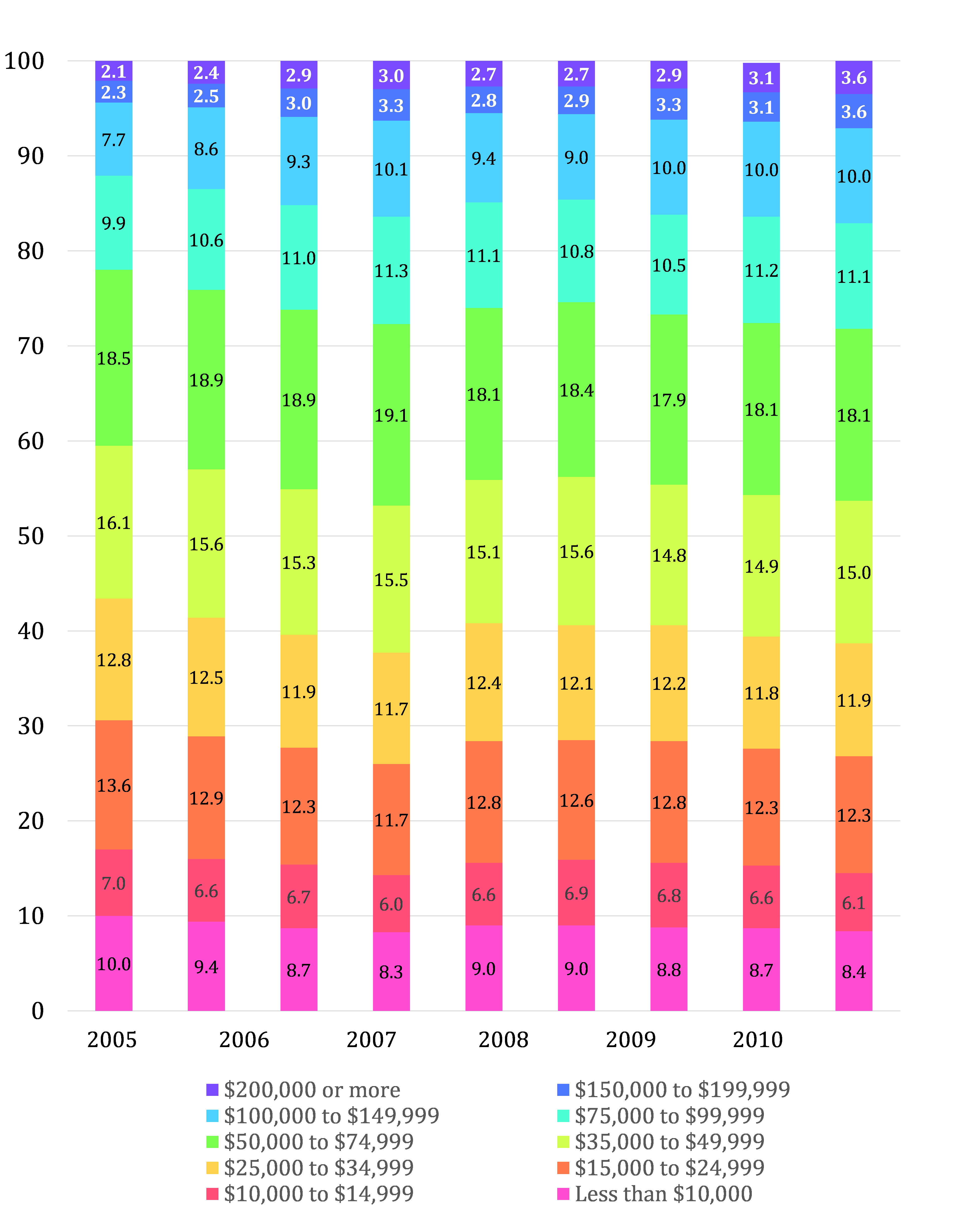 Source: author calculations based on data from US Census Bureau – American Fact Finder accessed January 5, 2015.
An alternative perspective comes from the statistic called the Gini coefficient. The Gini coefficient ranges between 0 and 1, where 0 represents perfect wealth equality, for example where everyone had the same level or share of wealth, and 1 represents total inequality, where only one person has all the wealth and everyone else has nothing. The Gini coefficient can be used to measure income inequality, or other characteristics of communities, in the same manner.
Gini coefficients are now available at the county level for the entire United States, wonderfully demonstrated in a data visualization map prepared by Steve Batt, the Connecticut State Data Center Associate Director (there are other data visualization examples found at the same web site). The map shows the continental United States, but one can zoom into North Carolina and its individual counties. The map is colored to show counties of greater or lesser inequality. If you select a county, you will also see where it falls along the distribution of Ginis of other counties across the United States.
Watauga County and Orange County have the highest levels of inequality in the state. Watauga County is perhaps not a surprise, if one considers it is home to Boone and Blowing Rock, popular vacation and retirement communities, where wealth co-exists with lower incomes common to rural mountain areas. Orange County is more surprising and reflects a division between the northern half of the county, again with a more rural make-up, and the wealth of the Chapel Hill area, a popular residential area for wealthier individuals across the research triangle area and its associated corporations, universities and medical centers.
Counties with high levels of economic inequality can pose difficult situations for CED professionals. Poor areas may not qualify for certain economic incentives available to other communities because the poverty of the one area is offset by the wealth in other parts of the county. Distressed areas can be hidden, lacking the visibility that might garner political support for change or funding.
Author(s)
Tagged Under
This blog post is published and posted online by the School of Government to address issues of interest to government officials. This blog post is for educational and informational Copyright ©️ 2009 to present School of Government at the University of North Carolina. All rights reserved. use and may be used for those purposes without permission by providing acknowledgment of its source. Use of this blog post for commercial purposes is prohibited. To browse a complete catalog of School of Government publications, please visit the School’s website at www.sog.unc.edu or contact the Bookstore, School of Government, CB# 3330 Knapp-Sanders Building, UNC Chapel Hill, Chapel Hill, NC 27599-3330; e-mail sales@sog.unc.edu; telephone 919.966.4119; or fax 919.962.2707.