
|
|
|
Community and Economic Development – Blog by UNC School of Government https://ced.sog.unc.edu Trying to Capture a Community’s CED: New Dashboard of Growth, Prosperity and Inclusion DataBy Maureen BernerPublished April 17, 2018The new Metro Monitor 2018 reportby the Metropolitan Policy Programat the Brooking Institution includes an enticing tool for CED professionals: interactive graphs tracking the growth, prosperity, and inclusion of 100 different metro areas over the last 17 years. For North Carolina, the areas include Charlotte-Concord-Gastonia, Greensboro-High Point, Raleigh and Winston-Salem, which might seem of limited interest to CED professionals elsewhere in the state. But don’t be fooled – the dashboards demonstrate a truly impressive way to spark conversations using data. The clear layout and intriguing results offers a rich opportunity for any CED professionals wanting to demonstrate the power of this kind of data, regardless of city or county.
With the year 2000 as a starting point, the maps and trend lines create an honest view of progress or deterioration, and allow comparisons with national averages or other major metro areas. However, the usefulness of the data does not stop there; any CED professional could use their own regional data for the same calculations and comparisons. To create the dashboard, the analysts used a number of sub-indicators to create broad categories that measure the areas’ progress. The prosperity of a metro area, for instance, is a rank comprised of the change in the average wage, productivity, and standard of living for that area. Growth and inclusion are made of similarly composited scores, giving each variable a clear single score that can be plugged into a national map. The options allowed by this program allow for some irresistible data combinations and comparisons, and raise some challenging questions about what is going on in some regions of our state. Why is Greensboro struggling on every indicator? And what is Greenville, S.C. doing that resulted in it being one of only two metro areas in the country that “made consistent progress in overall growth, prosperity, and inclusion, but also reduced disparities in racial inclusion by improving employment, wages, and poverty among both whites and people of color.”?
While the statistics are interesting enough on their own, the Metropolitan Policy Program has used these data to show some overarching trends about the interaction of prosperity, growth, and inclusion. Namely, all three variables are positively correlated. The findings, neatly summed up in the article: “Gains in one category, like growth, are typically accompanied by gains in others, like prosperity and inclusion, and vice versa.” Even more striking is the strength of the inclusion variable. Noting that metro centers with above-average performance on inclusion frequently have similarly stellar performance on the other measures, Brookings concludes that “in the long run, inclusion may provide the key to true economic success.” We want to highlight an important caution in using this or any other dashboard of city or county data: the broad trends shown in preliminary calculations only point to places where we need to know more. For example, this blog has previously written about the potential benefits of an inclusive modelof economic development. However, “inclusion” can easily shift definitions depending on context. Brookings’ metrics for determining how to rate inclusion are made up of three values
All of their measures of inclusion are income-based, presenting a dataset that could be critiqued for its limited definition. Additionally, we are given no information on how regions earned their successes and failures within the variables. Did areas with the highest inclusion composites achieve them because of affordable housing, active non-profits, or robust public transport? Or did their pre-existing inclusion lead to the creation of these systems? The lack of context provided by these rankings reduces the lesson to “inclusion is beneficial,” a difficult message on which to act. Similarly, we don’t have a sense of variation within the cities. Do data presented like this highlight success stories, or do the numbers hide parts of the population that have been left behind? Visualizations like this one are great teaching tools, but they should also be taken with a grain of salt. Metro areas continue to grow and change; understanding the nature of their development is absolutely vital to future planning and development. Use the data, but use them wisely.Screenshot (8) This blog was authored by Jacob Geller, Independent Investigator, and Maureen Berner, Professor, School of Government. |
Published April 17, 2018 By Maureen Berner
The new Metro Monitor 2018 reportby the Metropolitan Policy Programat the Brooking Institution includes an enticing tool for CED professionals: interactive graphs tracking the growth, prosperity, and inclusion of 100 different metro areas over the last 17 years. For North Carolina, the areas include Charlotte-Concord-Gastonia, Greensboro-High Point, Raleigh and Winston-Salem, which might seem of limited interest to CED professionals elsewhere in the state. But don’t be fooled – the dashboards demonstrate a truly impressive way to spark conversations using data. The clear layout and intriguing results offers a rich opportunity for any CED professionals wanting to demonstrate the power of this kind of data, regardless of city or county.

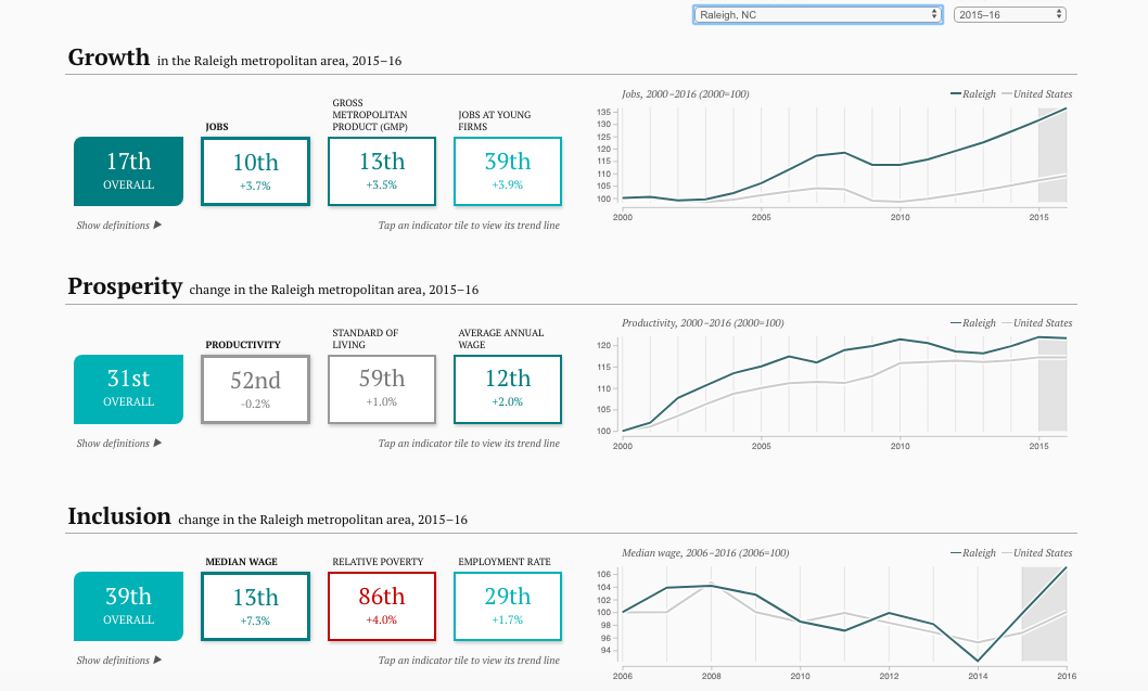
With the year 2000 as a starting point, the maps and trend lines create an honest view of progress or deterioration, and allow comparisons with national averages or other major metro areas. However, the usefulness of the data does not stop there; any CED professional could use their own regional data for the same calculations and comparisons. To create the dashboard, the analysts used a number of sub-indicators to create broad categories that measure the areas’ progress. The prosperity of a metro area, for instance, is a rank comprised of the change in the average wage, productivity, and standard of living for that area. Growth and inclusion are made of similarly composited scores, giving each variable a clear single score that can be plugged into a national map.
The options allowed by this program allow for some irresistible data combinations and comparisons, and raise some challenging questions about what is going on in some regions of our state. Why is Greensboro struggling on every indicator? And what is Greenville, S.C. doing that resulted in it being one of only two metro areas in the country that “made consistent progress in overall growth, prosperity, and inclusion, but also reduced disparities in racial inclusion by improving employment, wages, and poverty among both whites and people of color.”?
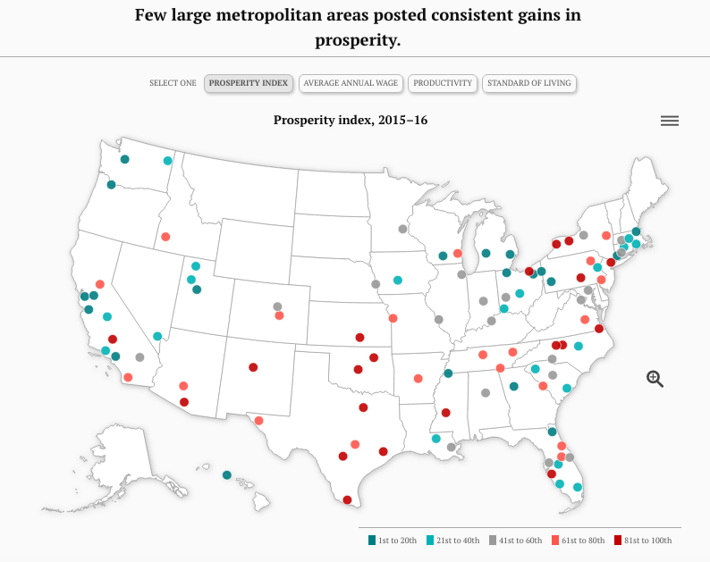
While the statistics are interesting enough on their own, the Metropolitan Policy Program has used these data to show some overarching trends about the interaction of prosperity, growth, and inclusion. Namely, all three variables are positively correlated. The findings, neatly summed up in the article: “Gains in one category, like growth, are typically accompanied by gains in others, like prosperity and inclusion, and vice versa.”
Even more striking is the strength of the inclusion variable. Noting that metro centers with above-average performance on inclusion frequently have similarly stellar performance on the other measures, Brookings concludes that “in the long run, inclusion may provide the key to true economic success.”
We want to highlight an important caution in using this or any other dashboard of city or county data: the broad trends shown in preliminary calculations only point to places where we need to know more. For example, this blog has previously written about the potential benefits of an inclusive modelof economic development. However, “inclusion” can easily shift definitions depending on context. Brookings’ metrics for determining how to rate inclusion are made up of three values
- Change in the employment rate
- Change in the median wage
- Change in the relative earnings rate (or, the number of people earning less than half of the local median wage)
All of their measures of inclusion are income-based, presenting a dataset that could be critiqued for its limited definition. Additionally, we are given no information on how regions earned their successes and failures within the variables. Did areas with the highest inclusion composites achieve them because of affordable housing, active non-profits, or robust public transport? Or did their pre-existing inclusion lead to the creation of these systems?
The lack of context provided by these rankings reduces the lesson to “inclusion is beneficial,” a difficult message on which to act. Similarly, we don’t have a sense of variation within the cities. Do data presented like this highlight success stories, or do the numbers hide parts of the population that have been left behind?
Visualizations like this one are great teaching tools, but they should also be taken with a grain of salt. Metro areas continue to grow and change; understanding the nature of their development is absolutely vital to future planning and development. Use the data, but use them wisely.Screenshot (8)
This blog was authored by Jacob Geller, Independent Investigator, and Maureen Berner, Professor, School of Government.
Author(s)
Tagged Under
This blog post is published and posted online by the School of Government to address issues of interest to government officials. This blog post is for educational and informational Copyright ©️ 2009 to present School of Government at the University of North Carolina. All rights reserved. use and may be used for those purposes without permission by providing acknowledgment of its source. Use of this blog post for commercial purposes is prohibited. To browse a complete catalog of School of Government publications, please visit the School’s website at www.sog.unc.edu or contact the Bookstore, School of Government, CB# 3330 Knapp-Sanders Building, UNC Chapel Hill, Chapel Hill, NC 27599-3330; e-mail sales@sog.unc.edu; telephone 919.966.4119; or fax 919.962.2707.